Content
- 1 Description
- 2 Key elements
- 3 Exit from the Form Constructor
- 4 To create a template
- 5 Publish
- 6 +Add element
- 7 General settings of the form
- 8 FAQ (frequently asked questions)
Description
Form Constructor is a simple tool which saves the precious time and creates a modern form in two clicks. The code of the form could be easily copied and inserted into third-party websites.
To enter the Subscription Form Constructor, go to “Contacts” – “Forms”. To create an order form, go to “Store” – “Order forms”.
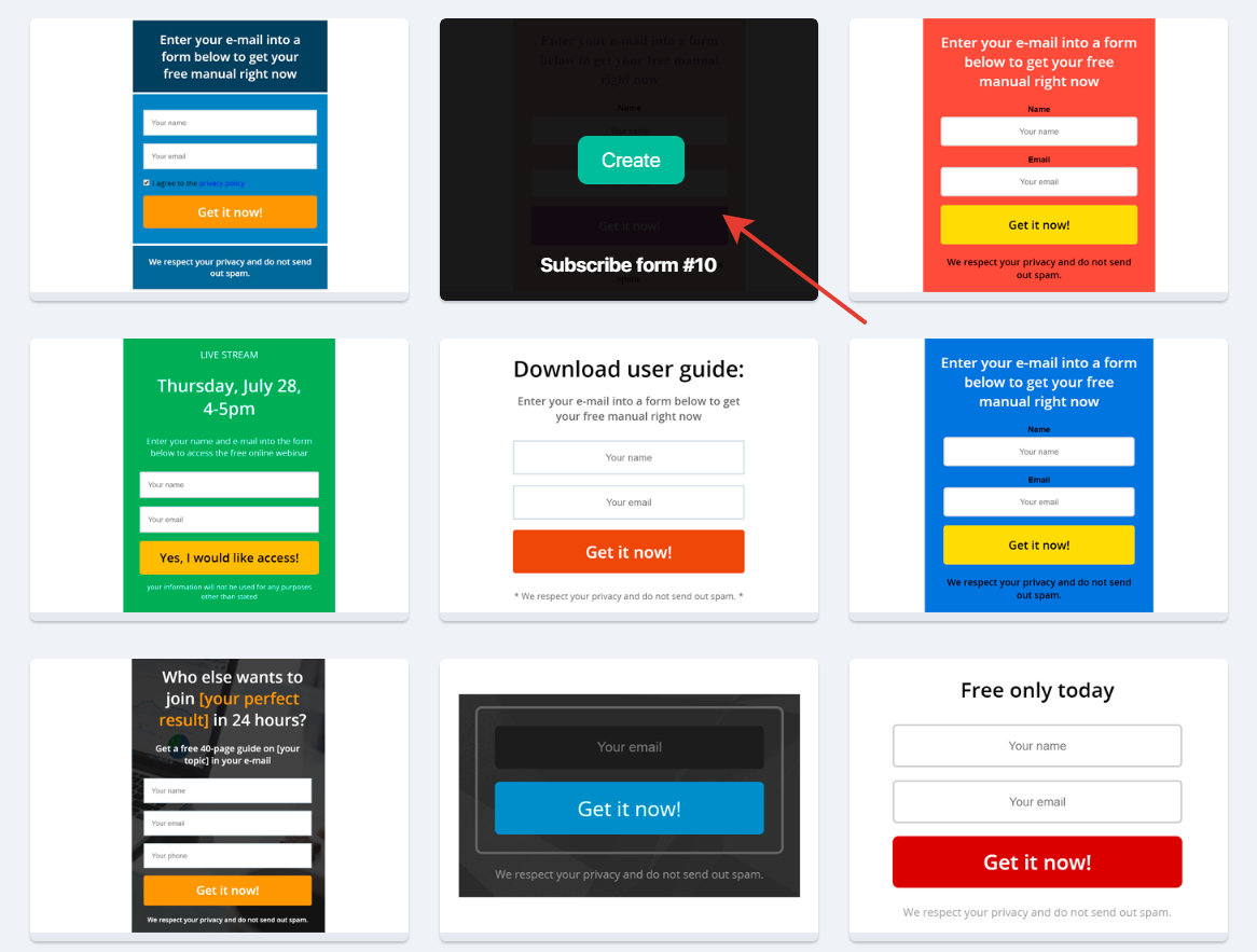
The opened window will show the ready-to-use forms developed by our designers.
To select an empty form, choose the one that fits your needs and click “Create”.
Key elements
Here is a screenshot to illustrate the functions of the buttons.
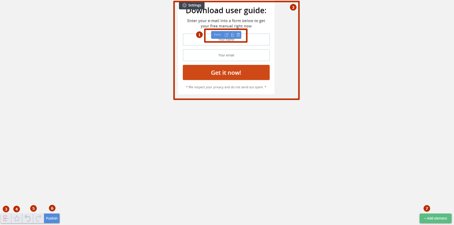
- widget control panel
- here you can preview the form to be displayed on your website
- exit from form constructor
- create a template
- undo/redo changes made
- click this button to copy the form code and to insert it into your page
- this button adds additional elements
Exit from the Form Constructor
When you click the button, a confirmation box will appear. When you exit the constructor, the changes you made in the form will not be saved.
To create a template
The system does not save the forms, therefore saving can be done by creating your own template. If you have already created a subscription form and want to use it later (not to lose it), then click “asterix”. Type in the name of the form in the appeared model window and save the template.
How to find your template?
Next time you enter Form Constructor, a new tab “My subscribe forms” will appear. This tab will show the forms you have chosen as a template.

If you point a mouse at your template, three buttons “Create”, “Edit”, and “Delete” will appear.
- Create — a new form is created in your template. In other words, the form will be similar to this template, and you can edit it with no impact on the parent template.
- Edit — in comparison with “Create” button, this edits a template, but does not create a new form.
- Delete — your created template will be deleted. Be careful, because the deleted template cannot be restored.
Publish
When you click this button, you will see a window with the code of a newly created form.
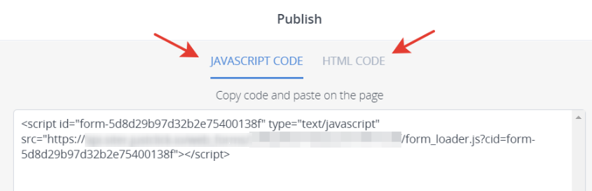
JavaScript-code
Copy this code and insert it into the required page. Please note that if you save a form as a template, in case of editing, the form published on the website will be edited together with the template.
HTML-code
In comparison with JavaScript-code, if published on a website, a form on the website will not be edited together with the template.
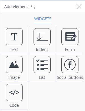
+Add element
This is the key button to work with the Form Constructor. You can open the menu with the available elements of the form by clicking this button.
Let’s look at each component by creating a real form.
Now let’s describe all components one by one.
Form
This component is enough for creating the simplest form, because it contains the functions you need for the work. It is included in every template, therefore let’s get straight to the form settings.
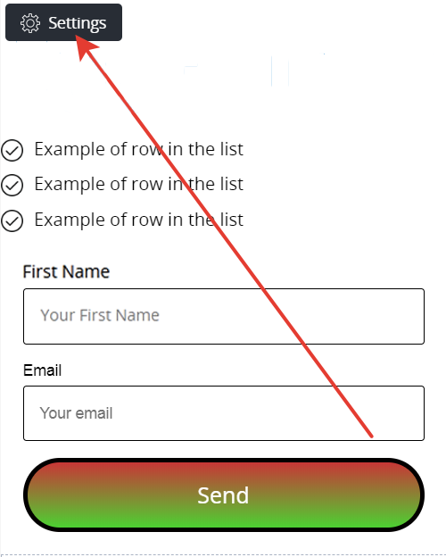
Settings
This is how “Settings” tab look like:
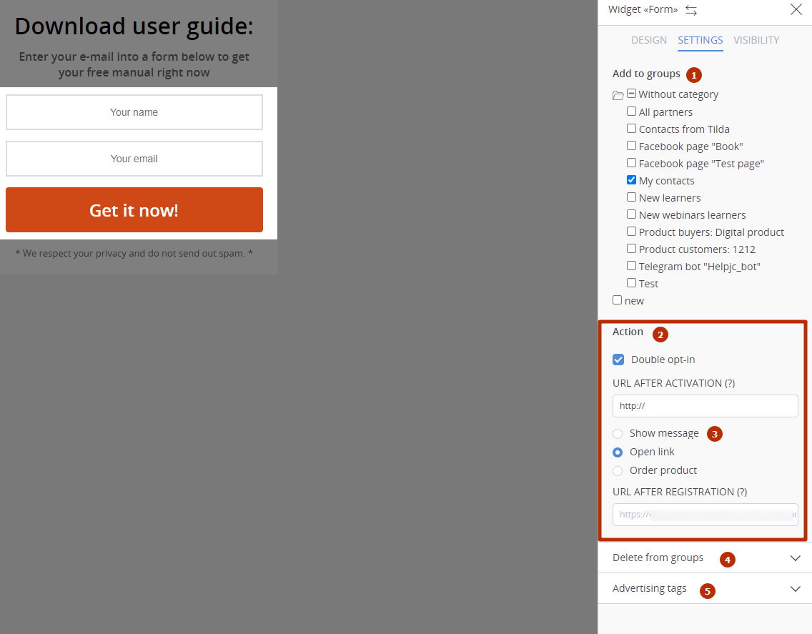
- add a contact to the group
- sing up or not to newsletters be checking/unchecking the box
- select action when visitor fills a form
- delete a contact from a group
- with the utm-codes you can monitor the statistics in advertise section
Add to groups
A contact will belong to the group (list)/category which you check. Please note that in case of checking a category, a contact will appear in all groups (lists) within this category.
To sign up for newslettes
It is crucial to understand how this tool works, because if you fail to use it properly, some subscribers could leave you.
- If the box is checked, then the form will add this contact into “Contacts” and send an activation letter. Once the contact follows the link in this letter, he becomes activated (subscriber) and can receive the letters from you.
- If the box is not checked, then the form collects the contacts (responses), the activation letters are not sent, therefore the contacts are not activated. This can be done if the subscription is optional.
Actions
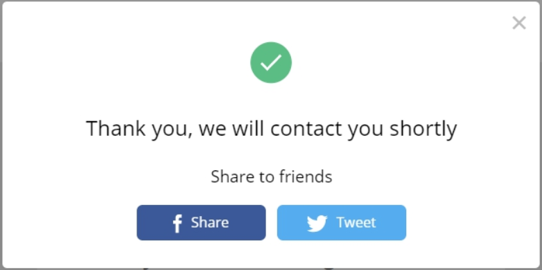
- Show message — when you fill in the form, a modal window with your text will appear.
- Open link — clicking an action button (“Subscribe”, “Participate” or any other word) will direct a visitor to the specified page. If no action button is given, then a visitor will go to your default page with a request to go to a personal mailbox and follow the link in an activation letter to start receiving the letters.
- Order product — clicking an action button (“Order”, “Buy” or any other word) will place an order for a product, and the users will go to the page with payment methods. If the form settings presuppose a user to check several products, then a user can decide which product should be used to place an order when filling in the form.
When you select this setting, you will be able to add the field “Payment card” * to the form. This field will appear and will work if you have a Stripe connected.The option has a positive effect on the conversion to a buyer and is recommended for use in most cases.The only disadvantage of this option is that if, for some reason, the invoice could not be paid, then it is not created in the system, which means that no reminders about it will be sent to the client.* Fields management and their settings are discussed below, in the “Form designer” section.
Delete from groups
A contact will be deleted from those groups (lists)/categories which you check. This option is helpful when a subscriber can subscribe to group A and unsubscribe from group B. For example, subscription to a group “Losing weight. Girls from 50 to 60 kilos” unsubscribes from a group “Losing weight. Girls from 60 to 70 kilos”.
They work the same as in “Reports” — “Channels” — “Add ad tag”, the difference is that these parameters will not be displayed in the link to the page, they will be inserted in the form code. You can track the efficiency of your advertising campaigns by these codes in “Reports” — “Channels”.
Design
This tab sets the graphics of the form, colors of the elements, background, etc.
Quick settings
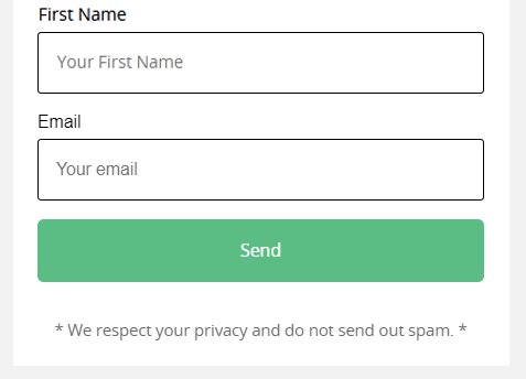
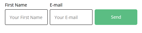
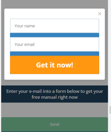
[Form view] can be horizontal, vertical, or it can be displayed in a modal window.
- A vertical form will look like this on a page:
- A horizontal form will look like this on a page
In modal box
If you check “In modal box”, then you should click a button to call a form. Three additional tabs for form settings will appear:

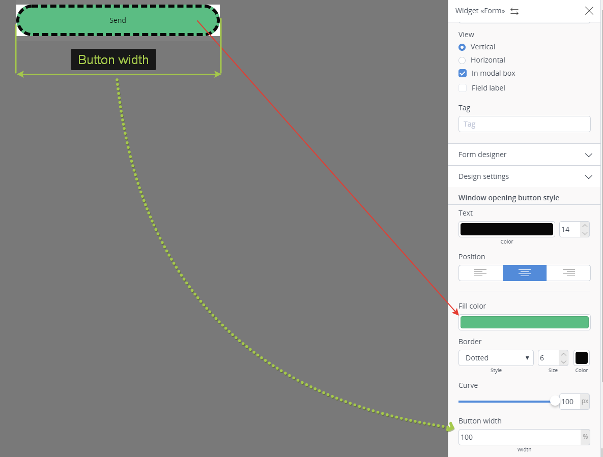
Window opening button style
- Form button is the button which opens a form. Here you can select a type of a button which will open a subscribing form.
- Filling is the color of the button.
- Width is stated in percentage which is calculated from the basic size of the form.
- Border — to illustrate, the screenshot shows a “dotted” type of border and a big size of the border. You can select any border type you like and customize the size.
Border works for all form elements in the same manner. In other words, you outline the element you are setting. - Curve — the screenshot shows the forms with rounded edges, the maximum rounding is chosen for illustrative purposes, but you can adjust this parameter by moving a slider.
Curve works for all form elements in the same manner, that is why we will not go into details here.
Modal window settings
For the modal window in the form settings, you can set the width of the window for desktop devices (the default setting is 40%).
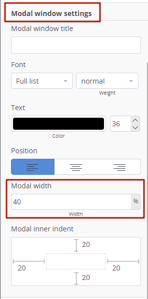
For mobile devices, this setting will not work – the width of the window will be selected automatically so that the window with the form is not too narrow.
Action when hovering over call button
This enables you to select the color of the filling. In other words, the color of the button will change when pointed.
Field label
When you check the “field label”, each field will have its name. We will give the details of how to set the field labels below.

Form designer
It enables/disables and sets the fields for the form.
When you move the slider to the right (green), you enable the field, and it will be shown in the form. If you move the slider to the left (grey), you disable the field, and it will not be displayed in the form.
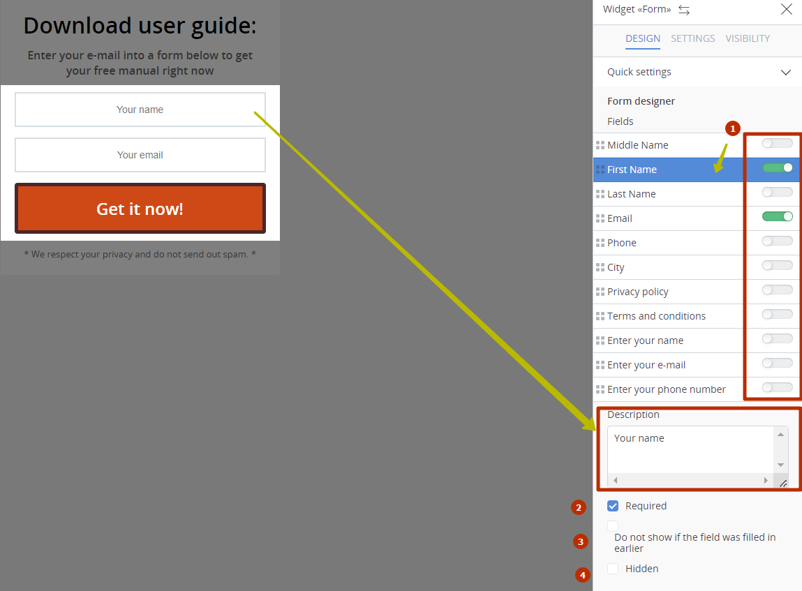
- enable/disable a field in the form
- if a field is empty, you will be prompted to fill in the field upon clicking
- the field will be hidden in the contact filled in a similar field in any other form
- in fact, a field will be in the form, but will not be displayed
Each field has its description. Description is the text which is shown at the background of the field (see the screenshot).
If you check “required”, a visitor can send these forms (click the button) provided he/she fills in all the required fields.
It is possible to hide the field if the contact has previously filled in a similar field in any other form. For example, if the form contains the fields ‘Name’ and ’email’, but the contact has already indicated an email address on another page, then only the field ‘Name’ will be shown to him in the form. If we know ALL the fields of the form in advance, then only the button remains of the form and all the fields disappear.
It is also possible to completely hide the field. If you check “hidden”, the field will not be deleted, but rather will be unseen by the users. The only exception is when you hide a “Name” field, a name “Dear friend” will appear by default, that is, the contacts of each person who fills in the form with the hidden “Name” field will get into your “Contacts” with a name “Dear friend”.
Payment by card
The field “Payment card” has been added to the order forms. Thanks to this field, the customer can make a purchase in “one click” immediately after submitting the form, without having to go to other pages, which increases the conversion to payment. Please note that this field will only work when Stripe is connected.

When using the form with the field “Payment card”, the order is placed and paid immediately after filling out and sending the form. If the payment for one reason or another did not go through (for example, there are not enough funds on the card), then an invoice for payment is not created.
Design settings
This menu can be used to personalize the interface of all form elements (button, form, fields, field labels).

Button
- Samples — 10 preset colors, the color of the button changes upon clicking the colors.
- Own color — it helps to customize the color from the palette. To open the palette, click the color.
If you select “Own color”, you can adjust the gradient. Check “gradient”, select the appropriate gradient type, and set the starting and the ending color.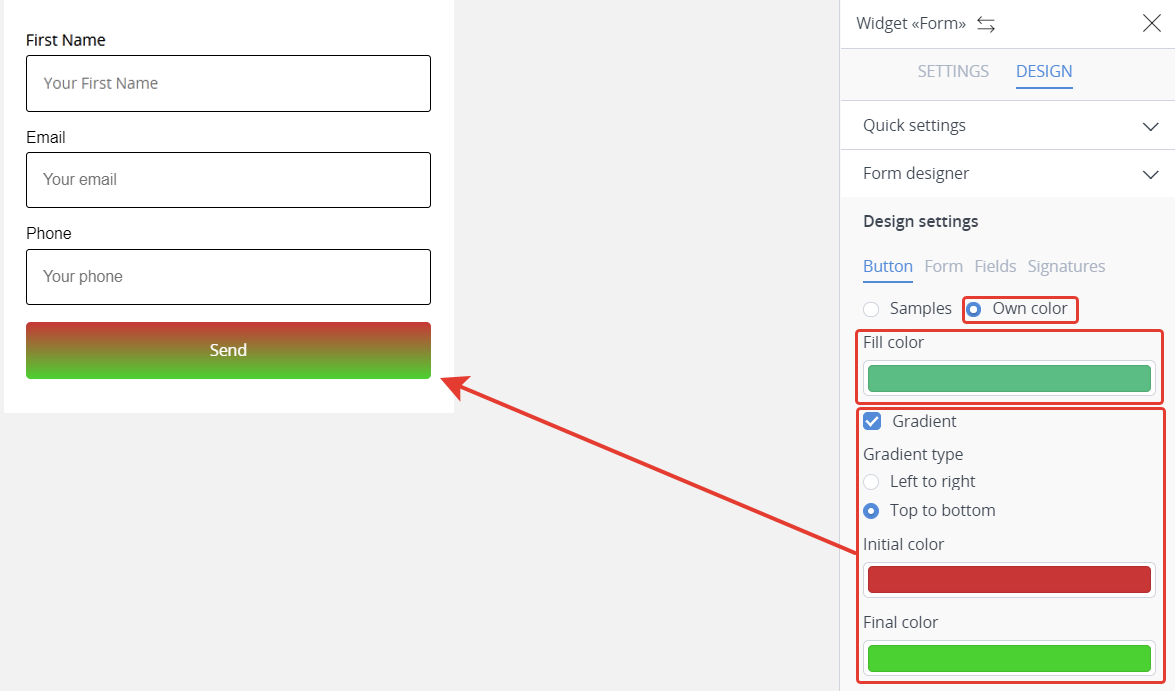
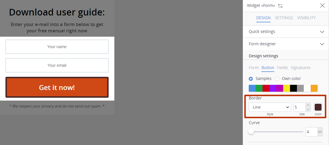
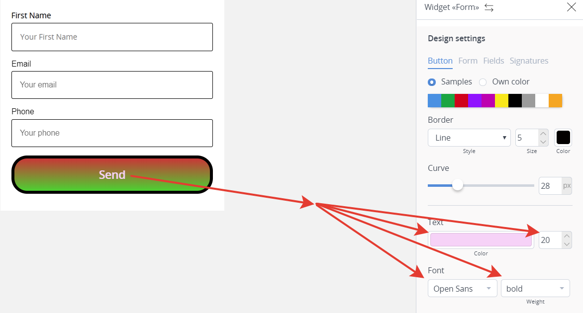
Border
The border will be applied to the button. You can select the style, size, and the color of the border.
 Text and font
You can select the color, size, font, and width of the text on the button.
In this case the text size is 20, font is Open Sans, the width is Bold.
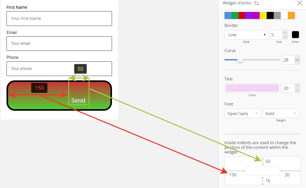
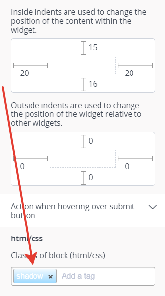
Inside and outside indents
Inside indents are used to set the spaces from the element borders to its content. Let’s me explain with the screenshot.
- Inside-left-indents (red arrow) is 150 pixels, that is why the text of the button is moved by 150 pixels from the left border of the element.
- Inside-top-indents (green arrow) is 150 pixels, that is why the text of the button is moved by 150 pixels from the upper border of the element.
The same principle is true for the outside indents, but we need them to adjust the spaces between the elements. For example, if the outside indents bottom is 150 for the fields of the form, then the distance between the button and the fields of the form will be 150 pixels.
 Form
Form
Now we will move straight to the field settings, as all settings which deal with the changes in the form design have already been illustrated by changes in the button.
In the settings of the widget “Form” in the item “Design settings” there is an opportunity to enter additional text that will be placed below the title block on the button, with the ability to set the font height. The top line text is edited directly on the button.

Fields
The field settings include “text alignment” setting responsible for text positioning inside a field. The screenshot shows that the text is centered, because “center” has been chosen. The text can also be aligned by the right or left sides of the fields.

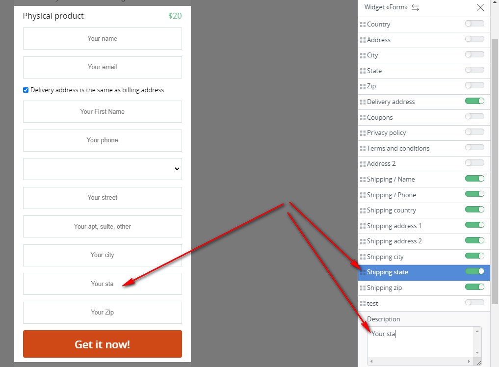
Also, when setting up the order form for physical products, it is possible to customize the fields for the delivery address. By turning the lever near a specific field to the green active position, you can change the text of the field name that will be displayed in the order form.
Signatures
This tab will not be displayed unless you check “field label” we spoke about above.
Text alignment affects the field label position. Just like with fields, the text can be aligned by the center, left and right sides.
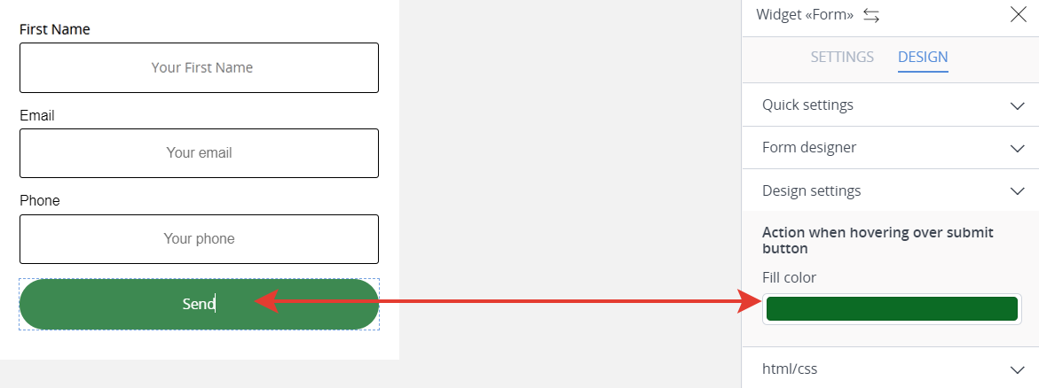
This helps to customize the color which will be displayed when pointing at the button. For example, the button “Send” is originally red, while when pointed it turns green.
html/css
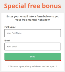
Here we register class, the rule for it is added to head or other place on the page, for example, before the form code. In our example, we have shadow class, the rule for it has already been inserted in head, now the button has a red shadow.
We are done with the settings of the basic and the most challenging element, now it’s time to find out the purposes of the other elements.
Text
Click “+Add element”, press “Text” by the left mouse button, hold down the button and drag the element to the required area in the form (the text is typically added at the top and at the bottom).
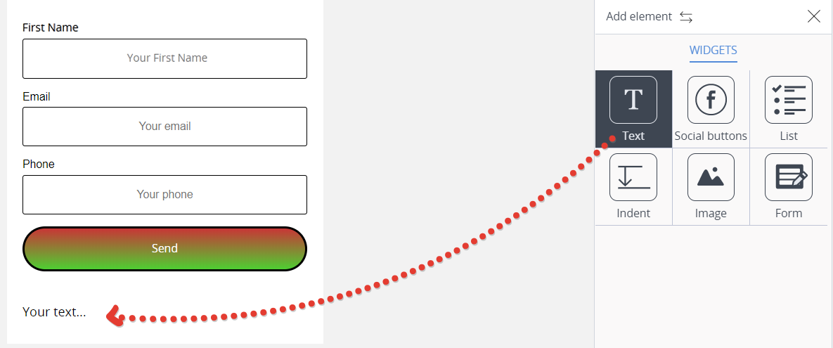
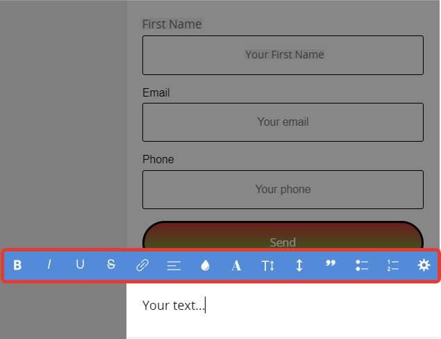
When you have dragged the text, the text “Your text” will appear. Click the text for editing. A default editing panel will open (highlighted by the red frame).
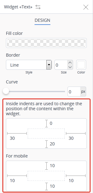
For your convenience, in the Text widget you can set different indent values for regular and mobile devices.
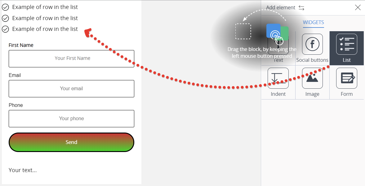
List
Click “+Add element”, press “List” by the left mouse button, hold down the button and drag the element to the required area in the form.
The screenshot shows that the list is added at the top.
List editing
List widget enables you to change the color of the text, picture, margins, and background.
Lines
To add/delete a line of a text, move to widget editor and follow the steps in the list constructor:
- Click “+” to add a new line.
- Click “-“ to delete the line which has been previously highlighted for deletion.
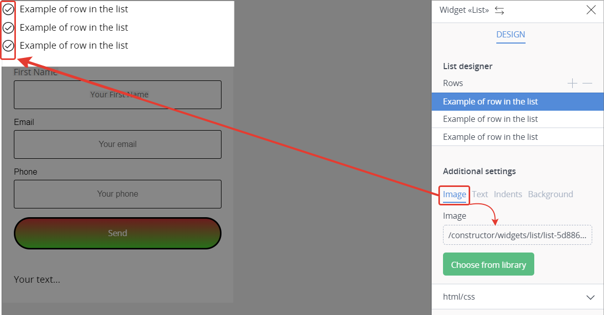
Image
The image shown on top of the list can be edited, if required. If you click the image path, you will be prompted to upload an image from a computer. If you click “Choose from library”, you will be offered a collection of the appropriate images.
Click “+Add element”, press “Social buttons” by the left mouse button, hold it down and drag the element to the required area in the form.

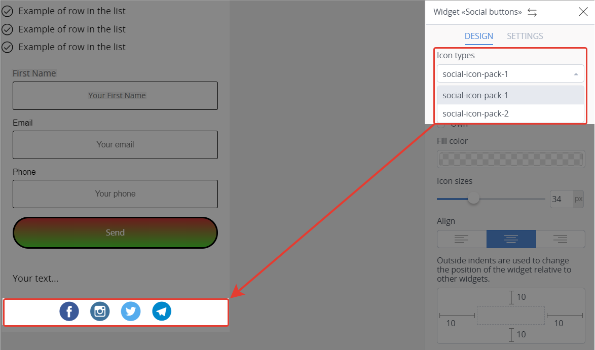
The settings of this widget enable you to change the icon types, alignment, margins, as well as to delete or to add the social networks
Design
Icon types
You can select from two types of icons: social-icon-pack-1 — rounded (see the screenshot), social-icon-pack-2 — square.
Settings
The widget displays the social buttons which are checked in its settings. To place a link to your social network, place the mouse cursor over the name of the social network to see “cogwheel” which will open the menu to add the link to a social network.
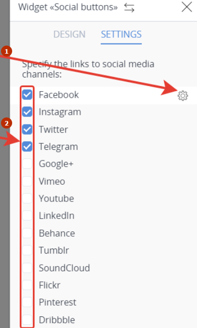
- insert a social network link
- enable/disable display of the social networks in a widget
Indent
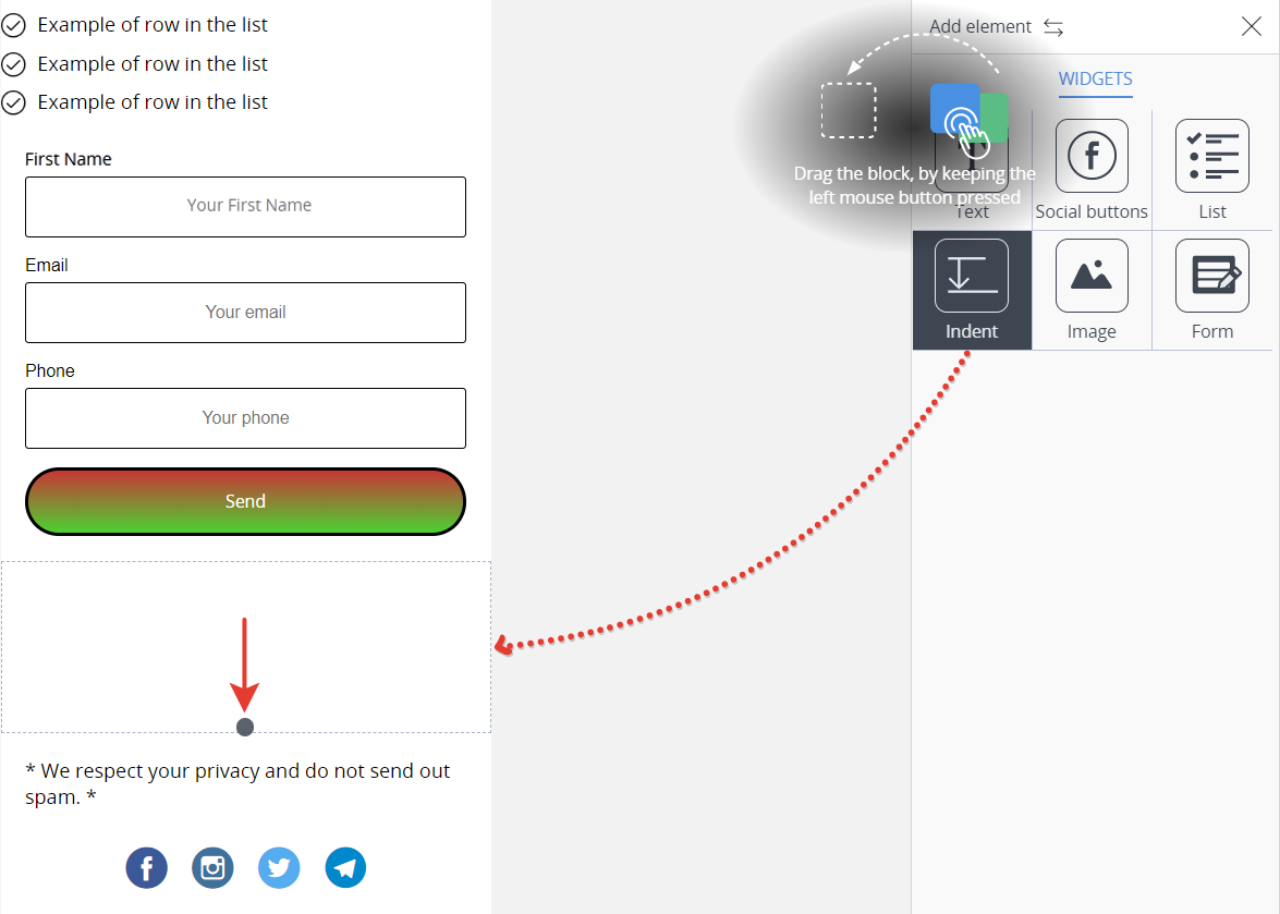
Click “+Add element”, press “Indent” by the left mouse button, hold it down and drag the element in the required area in the form.
Unlike other widgets, this one has no Edit button. It can be vertically adjusted only. To change the indent, press the black dot (highlighted by the arrow on the screenshot), hold it down and pull up or down. This can be helpful when you have no time to match the pixel size for the margins, that is why it could be easier to add “Indent” widget and to adjust it visually for a couple of seconds.
Image
Click “+Add element”, press “Image” by the left mouse button, hold it down and drag to the required area in the form.
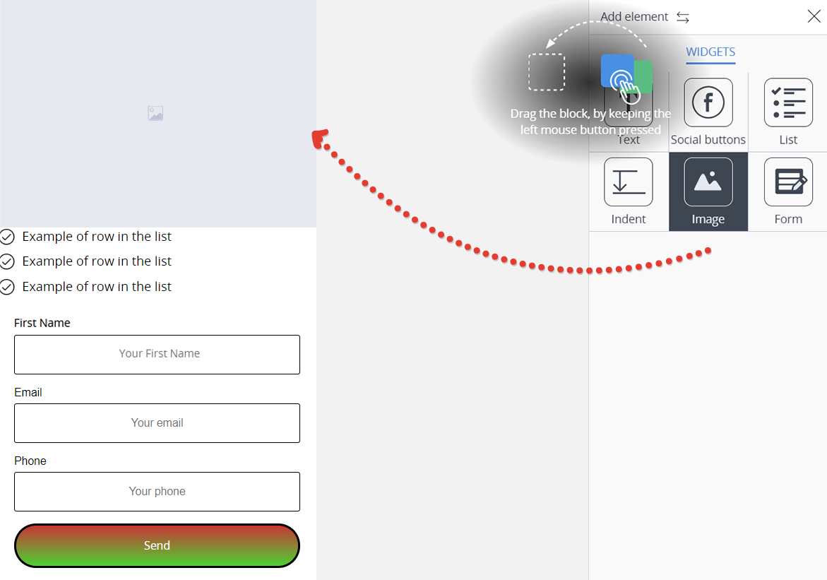
Code
Press ‘+ Add element’, hold down the left mouse button ‘Code’ and without releasing the mouse drag the element to the form area, to the place you need.
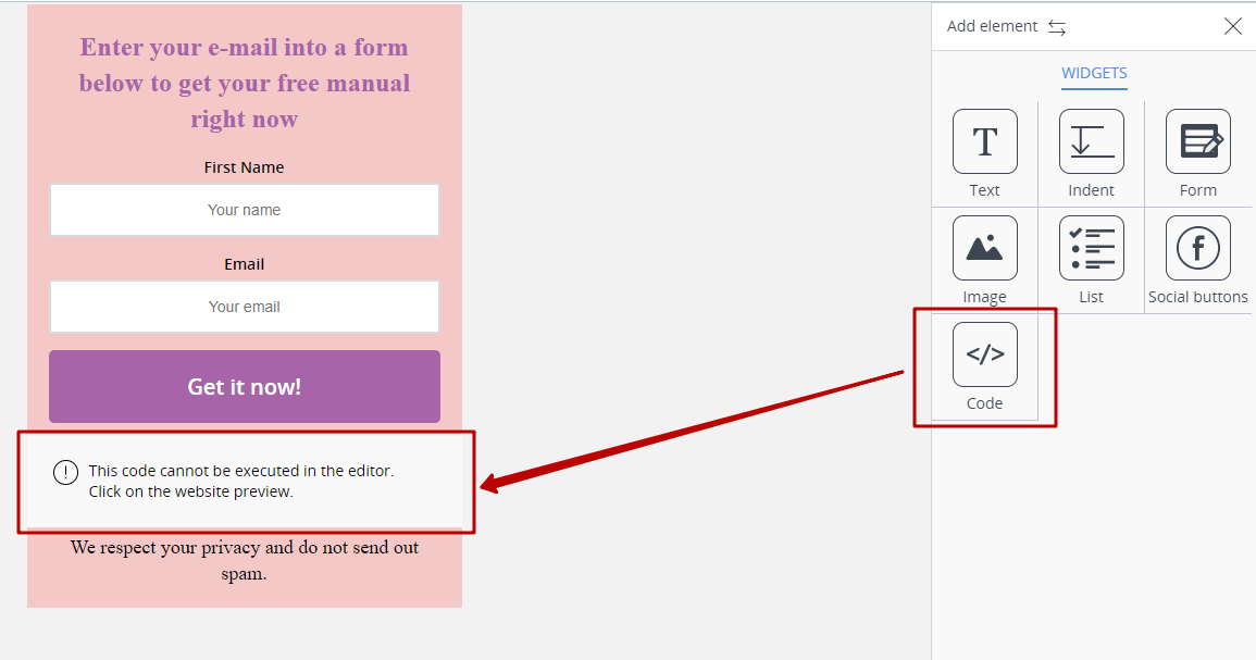
In the settings of this element, you can add html or java-script code. This code will work on the page where you add the form itself.
General settings of the form
The form has the settings for the widgets and the general settings (we have illustrated them above) which can be applied to the form on the whole rather than for a particular element.
The form width should be paid special attention to. It is set in pixels. This is required to adjust the form width for better interface of your page.
You need no more than 5-7 minutes to create the simplest form with all widgets, because there is nothing technically complicated about it, the interface is user-friendly and intuitive.
The screenshot below gives the form as an example, the process took less than 10 minutes, and mind that the form was completely customized.
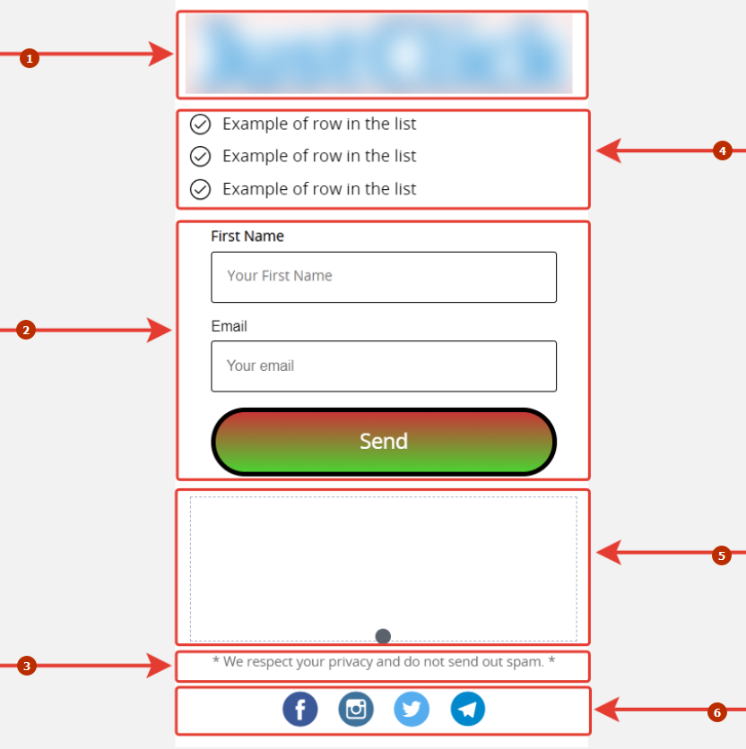
- image
- form
- text
- list
- indent
- social networks
If you have already set the payment methods, then a buyer will have the access to the payment options upon form completion.
FAQ (frequently asked questions)
Create separate pages where a subscriber or a client is redirected to upon subscription (payment) and install the metrics codes, pixels on this page, add the page links for analytical purposes. These links should be inserted in the Form Constructor in the appropriate fields.

 Loading...